Grrl Power #533 – Super generic debrief
Sydney probably shouldn’t be telling anyone outside of the team about the visit with The Council, but the only information she’s given the two of them was that the team was doing something a few nights ago, (and everyone already knew they were having dinner at some place in New York) and a female bad guy was involved. The way she sees it, the team is always going to be doing something or other, and Sydney was told not to tell anyone about The Council or vampires or aliens or anything like that, and she didn’t.
I partially wanted to put this page in for the people who complain that the comic’s been around for 6 years and only 3 days have passed. Well, now it’s been like 5. Sydney gets Tuesdays Wednesdays and Saturday mornings in the comic shop, as per her arrangement with the team. (For some reason I was thinking new comic day was Tuesday) Don’t worry, with Sydney grounded and the brass and Arc-LIGHT trying to figure out where Sciona absconded to, we the readers haven’t missed much. Sydney’s basically been sequestered at the base, sitting in class being bored while learning Law Enforcement 101 stuff, and trying to learn how to shoot straight. I’m sure there were probably several hilarious moments, but in the interest of advancing comic time a bit, you’ll have to imagine those for yourself.
Double res version will be posted over at Patreon. $1 and up, but feel free to contribute as much as you like.







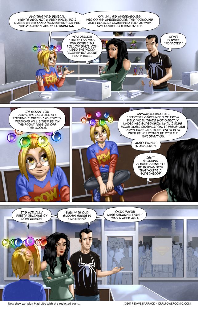




Sydney is missing her choker in the last panel.
Congratulations for spotting the mystery clue. You win one free comic from Sydney’s shop. Of course you will have to move to the back of the line. I think it is somewhere behind that TV news truck.
Nah, it’s just hidden by her T-shirt collar.
No, look at the first panel, her choker is above the collar
Maybe she took it off between panels. Honestly, if I were her, I wouldn’t wear that thing. It was gifted by a megalomaniac who might of the power to control metals if I recall; I wouldn’t want a choker that contains a ring of metal around my neck at all times. Even if it’s got a gadget or two built in, I’d hang it off a hemp necklace or something… don’t want an insta-noose on at all times for someone who may or may not be a villiian.
What? The choker is from Archon, the rebreather is from Deus, and, don’t recall him being listed as having any sort of super powers
Well, there are suspicions, but nothing proven. Maybe have Dabbler ask him on a date and see if she gets the super-charge.
Dabbles gets a charge of anyone, don’t really believe there is that much of a difference from a ‘normal’ and a ‘super’
Supers provide a little more of a charge for her and they resume consciousness sooner than muggles.
The metal controlling guy was the one with the underground vault full of gold, who is distinct from Deus.
I think rather than ‘took it off’ it simply is not visible from the back because it is concealed by the neck of her top. Check panel 1 and you can see it close enough to that point that is reasonable.
Plus Dave does forget these things, from time to time.
If there is a plot significant point, to taking it off, Dave would actually show us that. Given that we saw Harem’s left on her night-stand, when she went visiting Deus. A clear implication that she did not want Archon tracking her location, at that time.
Mind you Sydney did fidget with her choker, when it was fitted. Indicating that she found it uncomfortable. So I think that if it is plot convenient, at some point, she will have taken it off for such reasons.
That being said, didn’t Max say that Sydney was to wear her wristband thingy at all times as well? Mind you, it might have been at all times when on-duty.
That would be implied, either way. Even in the military I think they would be expected to emphasise ‘even when off duty,’ for a proposition that impractical. For example it clearly cannot be worn whilst showering. Plus we saw that Halo’s chafed her, even when it was first put on. So clearly it is not made from some ‘super-comfortable’ material.
Why do you say it “clearly” cannot be worn while showering? It’s not a very good radio if a little water ruins it, after all. Soldiers don’t get a pass from battle during a rainstorm, and their gear needs to be able to function in all kinds of conditions.
The steps required to mil-spec a piece of equipment probably preclude the use of soft fabrics. I’d expect that any cloth parts of the chokers would feel similar to BDU fabric: Nylon and cotton, but certainly not soft and comfy like a tee-shirt.
Because Sydney would not be able to wash underneath it.
The collar isn’t missing, you can see it vaguely when you zoom in. But it looks like it’s on the wrong layer, and only barely shining through.
So does this mean that Sydney’s cuteness has risen so high that her choker has become sub-cute-aneous?
Has Olivia burnt her forehead?
SNIPER!
No… wait… my bad. Shadow.
Oh God her blue sneakers are adorable….
How would Sydney look in that yellow and black tracksuit as worn by Bruce Lee in The Game of Death?
Smokin’!
How would she look in that zoot suit from The Mask? Also smokin’!
Sydney wouldn’t act that different than normal if she wore the mask. A Mask/Grrl Power crossover sounds like potential comedy gold.
Just don’t let Vehemence get a hold of the Mask. There would be little room for humor if that happened.
I don’t want to know what would happen if Dabbler or Math wore the Mask. Okay, that was a lie. I would read that comic with glee.
<a href="https://www.youtube.com/watch?v=orAfWcsMjJE"Math on the Mask. Mostly the third scene, but the others could apply as well.
Hmmm. Still no way to edit after 6 years…
Math on the Mask. Mostly the third scene, but the others could apply as well.
Okay, that lighting on Sydney’s face was okay before because she was in dark spooky environments and you want the aesthetic to reflect that. But it’s no the day in her comic shop, so can Syd be less pale and shadowy looking?
Guess what? Some people are that pale and shadowy looking in real life
She and the sun have an off again on again relationship. Mostly “off again.”
Yeah, I was migrating to a more moody lighting during the whole Council thing. It might take me a few pages to reset to the more global illumination of stores and, you know, daytime. I was thinking most of the light would be coming in through the window since it’s early and the sun is low, but it kind of looks like they haven’t turned on the lights in the shop or something.
to be fair, depending on how early it is, there’s a good chance that’s exactly what is happening. if they’re not stocking/inventorying, they may well keep the lights off, as an extra indicator of “we ain’t open yet, you addicts!” that, and people seriously underestimate how much heat that many fluorescent tubes puts out…
Have to agree, I don’t care for the new art style. It doesn’t suit the cartoony, Warner Brothers style of the content.
The only one personally have a ‘problem’ with, is Olive, but that can be chalked down to DaveB not having drawn her in a long time, just like what happened with Anvil
No, it’s the whole style.
The general tone of the comic is exaggerated, slap-stick at times, with occasionally some quite graphic violence (who got a knife through their foot and lost a toe?). Max destroys a tank at one point, gets her clothes blown off like a Benny Hill sketch later on. Sydney flails around like a washing line in the wind when she’s excited, or eats spiced noodles that are handled with tongs in a public restaurant.
It needs a “Tex Avery” art style to carry off the surrealism. Roger Rabbit had a “solid” art style because it had to accommodate live-action backgrounds and actors, plus cartoon characters from different eras and studios, but that was a different medium.
Did say ‘personally’, and meant on this page, Olive, to me, seems the most changed from her last appearance (almost unrecognizable), and her last appearance was not in the style of her Mugshot
The art in her Who’s Who thing is like 6 years old. Granted she is kind of shadowy on this page.
Yes, but there was a slight art style change when we last saw her (not meaning to argue with the creator artist, just attempting to properly explain)
Not important, but it bugged me: those were chopsticks, not tongs, unless tongs is another word for them?
Now, after a quick google, I’ve discovered that people in Thailand don’t actually use chopsticks, but got the impression that a lot of people eating in Thai restaurants in america do, because we’re just so culturally aware like that.
So the way she ate the noodles was kind of wrong, it wasn’t as off as your tone made it seem.
I just spent five minutes to say that one sentence really. I make good life choices!
And then didn’t notice I had fucked up the grammar in that one sentence until I had already posted it. FML.
Sorry but your name leads to a page that is not available. You might want to check your URL MoC
This might be him:
https://www.youtube.com/channel/UCcnBY7UO_WXyu2F_rxci6iA
Give it a few pages. I’m still experimenting with the coloring but there’s a few more cartoony bits here and there. I seem to have drifted away from the cartoony stuff lately, but I’m getting back to it.
Always felt your style was ‘mixed’: some characters ‘anime cartoony’ (Sydney, Kronachrome, Dabbles occasionally) with the majority more ‘western normal’ (Maxi in particular)
It is a bit like the time the Simpsons went into 3D for one of their Halloween episodes. You can still recognize the characters, but they look substantially different from what you are used to.
I agree the art style was better when it had less texture / shading and more solid outlines.
The shift is lowering the contrast between characters, objects, etc. It is becoming more difficult to spot immediately where the boundaries of things are. Slipping entirely too close to artistic existentialism.
Is that Wendy outside the window
I have to agree with the others, the strong ‘realistic’ shading isn’t helping particularly much. The highlight on Joel’s face in the first panel basically sums up why it doesn’t work. it looks too dramatic. I see why you want to use an artstyle like this, but it really doesn’t fit the comic.
If you want inspiration on how to make a ‘realistic’ artstyle that still fits a goofy comic, look up Stjepan Sejic, especially his superhero “doodle” comics.
I’ll reply with an update on the last panel where the artstyle of the characters fits the comic again.
nevermind, it seems its mostly this latest panel that looks REALLY off… The style you’re using kinda works for backgrounds, but for character’s faces it feels WAY too serious. It also looks like it takes you way more time than it should, causing you to lose focus on your magnificent facial expressions (examples: Anvil, Olivia, to some lesser extent even sydney).
I noticed that someone did a very good job of avoiding the necessity of drawing Noel’s bald spot…
Joel re-worked his contract that he can only be shown from the front :D
And the camera-operator supported it (there were too many complaints about ‘glare’ and ‘lens-flare’ :P )
Don’t call call him Noel. He is definitely no coward. He works with Sydney every day after all.
Never mind the fact that only 3-5 days have passed….
If I ‘member rightly, the WHOLE COMIC up ’til now is a flashback!
I half expected that Sydney’s apartment building and comic shop would be surrounded by MPs at Arianna’s request following her ambush by the press awhile back.
BTW-For those not familiar,MP stands for Military Police.
Thought it odd for her to be protected by Members of Parliament, seeing how ‘Murica is a republic and doesn’t have one :P
It’s a good thing Sydney doesn’t have to keep secrets the same way Emily from Questionable Content does.
“I partially wanted to put this page in for the people who complain that the comic’s been around for 6 years and only 3 days have passed. Well, now it’s been like 5.”
Every time I reread the comic this is always at the forefront of my mind until this very blessed page. In a way it’s my favorite page in the whole story, and it’s so nondescript, but I remember it and wait for it every. single. time.