Grrl Power #352 – Superman never has to file a flight plan
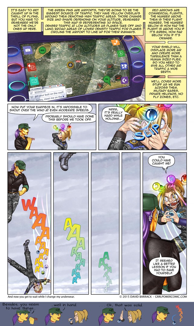
I know that’s a big blob of text at the top of the page. Self editing is tough, cause you can always convince yourself that any detail or bit of dialog qualifies as world building, and conversely you can tell yourself the more you cut, the better an editor you are. Each of those is only sometimes true, so I just write like I do and edit as I go. Hopefully it’s the right amount. Also hopefully all the air traffic stuff makes sense. It’s not supposed to look like an actual air traffic controller’s screen, but actual “this is what a flying person sees when they look down” maps and combine them with layers of practical information.
I think I’ve shown a closeup of the wrist com before, but the buttons weren’t glowing. They only light up after you interact with it, so I guess Sydney just poked the screen.
I think the funniest thing on this page is how Sydney immediately repeats her mistake when going for the high five. I just wish I could have fit it on the page proper.
Forgot to mention: This page colored by Keith.
Here’s the link to the new comments highlighter for chrome, and the GitHub link which you can use to install on FireFox via Greasemonkey.







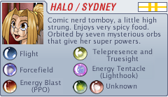






I was thinking about the page where we were discussing salaries and I was thinking, if we removed Sydney’s Morality and personality, just thinking about powers. Sydney vs US super carrier battle group, who would win? My money is on Sydney.
Just powers? We haven’t seen that anything in the US arsenal as it stands would even scratch Sydney’s shield. Maybe a nuke, but we can’t be sure. (And she has an easy way to handle that: Stand on the deck of the flagship. Nuke her, and you nuke the entire group.) On the other hand, we’ve seen the PPO cut straight through more armor than the battle group is likely to be carrying. So: Sydney, by a landslide.
Really, with a bit of planning, Sydney could take on the entire US armed forces and expect to walk out without getting hurt. She needs some way to replenish the air in her shield, but that’s her only real weakness in that scenario. (Well, that and she might get tired before she kills everyone.)
And she’s not even the strongest super around.
i dont really think that sydney would stand much chance against a US carrier group, at least not this sydney at this point in the story future sydney with more powers and abilities and a better control of her orbs would probably stand a much better chance, but for example she can only hold and control two of her orbs at the same time so either she can fly and have a shield or fly and have other power but ger her shield down or not fly but be able to use her other powers
the PPO is powerful and could probably cut or severly damage an aircraft carrier with it but she would have to down her shields to do that and the carrier has CIWS that can hit a missile traveling at super sonic speeds so probably not a good idea i seriously doub that she could survive getting hit by 6000 30mm rounds per minute, her tentacle is powerful but i doub is powerful enough to destroy a carrier (she could maybe carry a bunch of jets and throw them around, we do know that the tentacle is at least strong enough to lift a car but we also know that it does have a limit to how much weight it can lift) and this is a carrier group which means that the carrier is only the comand ship there are several destructors, subs and other ships around that could cause some damage
also as its said we dont really know the true limits of her shield, it could be indestructible but i doub she would really like to test that against an anti ship misile those things carry quite a punch
honestly Sydney at the current point of the story could take on a carrier group, she can do the trick where she lets go of the fly orb and quickly fire her PPO while she allows her momentum to carry her, there is nothing in the US arsenal short of a nuke that could scratch her shield so her flying in a predictable parable would be no real issue
Sometimes the most important lessons hve to be learned the hard way.
So… not to derail the conversation about Java and replies, but… from my admittedly fuzzy memory, when describing how she activates the orbs, Sydney says that she tried other body parts, but ‘only hands work’.
Which begs the question- could she… for lack of a better term… telekinetically… hold the orbs against the back of her hands to activate powers while still keeping her hands free? Or even have four orbs going at once? For that matter… I’d actually kind of like to see a Dabbler’s Science Corner about Sydney and her orbs- how far she can actually send them away, and if their motion (as opposed to their lack of motion :P) can have any effect on her, the back-of-the-hands question, what the limits of their lift-capability is, that kind of thing.
… also, what would have happened if Max had grabbed one of the orbs while Sydney was falling?
I’m assuming that since Sydney is tethered to the orbs, and it’s already been shown that the tether is strong enough that even Max can’t pull the orbs from Sydney’s tether, that Sydney would stop falling.
No, the Orbs are tethered to Sydney, and the Tether is stronger than Max. If Max grabbed an orb, she’d fall, too; the Orb would pull her.
https://www.grrlpowercomic.com/archives/268
Actually it could stop Sydney as Max has stopped an Orb before to halt Sydney as the Tether works both ways.
Actually we’ve theorized a similar situation about someone putting the tube (with the orbs) in a helicopter and taking off happening but as yet have no idea what reaction would actually take place.
With the link provided by Sendaz above and this one I think it’s safe to say that Syd and her orbs must move as a unit. If one can’t move neither can the other.
true but we have yet to see if someone else tries to fly with the orb if they’d be even be able to fly or if they’d end up towing a highly irate Sydney
i think based on the two links if she is caught unaware the orbs will stop her if she is aware she dead stops the orbs so i think there is a willpower effect there she might me able to choose what effect happens so with that beign said she could cause max to fall with here if she wanted or stay afloat if max held on
Actually, since Math used them to move her during their fight, I think they also influence her movement just as much as she influences theirs.
Although there may be some weird rules to it that haven’t been explained yet.
Technically all Math moved was Halo’s leg. What followed was simply the consequence of her being in the path of a fast-moving object.
It is worth noting that the orbs were, at that time, under Sydney’s orders. It is possible that is the only reason why the collision actually happened, without the orbs avoiding it.
My reason for saying that is Halo has been in various crowded situations and we have not once seen an accidental bump. Given that the orbs are in constant motion, at head height (and Sydney is relatively short), they would have been bound to hit somebody by now, if they were devoid of collision avoidance capability.
That IS quite distracting wall of text, so here’s my 100% unsolicited opinion how to improve it. This from a reader who dislikes technobabble and knows somebunch about air traffic.
While world-building is nice, readers only need to know about fraction of that. The screen is very good, let it speak for itself – show don’t tell and all that.
– Point about air congestion bubbles being 3D is cool, but can be said in half the amount of words.
– I don’t need to know what shape the congestion pattern is.
– I don’t need to know how the altimeter works.
– Shield bubble still doesn’t seem like it could be worse than the tiniest of business jets, so its turbulence isn’t an issue for airliners at least.
Oh, and Sydney’s second slip from the orb is great one. Works just fine from the margin.
We don’t need to know, but Sydney does. This is a “information” page. they happen every now and then.
I did not find it distracting in the least. It is mostly common sense, but having it as an app is genius. Since Sydney needed to know all that and most people don’t really apply their minds to situations like Halo and Maxima are about to experience, I thought it fit well to go over the details.
I think it was perfectly done. Less info would feel weird given this is stuff she needs to know. And the arrangement around the app panel is perfect. It feels like looking at a video game tutorial.
So… Am I the only one wondering what Leon sent Sydney?
Leon? What about DABBLER?
History of succubi and vampires. /nod
Yup, ditto.
Transponder-equipped wristband? Doesn’t that means there’s a probability that hostiles could track Arc-SWAT members as well as ATC?
The only thing missing from the display is any indication of the Airport’s controled space, (Class B) around bigger airports itlooks srt of like an upside down wedding cake. Entering that airspace gets you flagged and passed from one controller’s tracing to another until you land ad then you get the pleasure of explaining why you entered controlled/restricted airspace without permission. It could lead to a fine, grounding (lose of Pilot’s License temp or permanent), and possible criminal charges/jail time and that was pre-2001.
Either way bad things happend and Syndey as a member of the military would aso have to answer to her commanding officer regardless of whether or not was during active duty/deployment/use of military equipment or not. Plus wrist thingie has a transponder in it so that means she can be tracked by ATC while wearing it.
I knew a pilot that clipped an airport’s controlled airspace didn’t realize it, he was flying VFR and in air plane with a very weak radio, and when he landed several hours later then spent several hours talking to the FAA and that was in the 1980s or early 1990s. He had a suspended License for a couple of months and a fine (small like 50-100$US), but it could have been much worse.
Technically, military pilots aren’t licensed by the government (FAA) and can’t be “punished” by them directly. They are only answerable to their own chain of command. I assume flying “supers” working for the government would be treated the same way.
That being said, woe be unto the pilot who caused a serious problem without a good reason.
I could mention doing a low level sight seeing flight around Devil’s Tower, Wyoming in an EC-135 while waiting for an “elephant walk” (alert taxi exercise) to clear the runway back at home base. Or that it’s very possible that it was below “legal” altitude over a national park or monument. Or that shortly thereafter the base issued new rules for a minimum flight altitude over Devil’s Tower. Or that nobody ever said a word to us. But that would just be anecdotal evidence. ;-)
Ahh, sounds like your background might also explain your colourful call-sign too. :-)
i’ve been going back through the comics for probably the 5th time, and arc-dark doesn’t really sound great. how about arc-night? cast your votes please! or if you have better ideas
Is DaveB still looking for possible organization names? I understand that he was back at the beginning, but don’t know if he still is. In any case, I like Arc-Dark well enough.
I used to do a lot of writing back in high school and had a whole series about a guy who was an agent for the FSP, the Federal Security Police, which was described as sort of FBI crossed with the CIA. Later on in my stories, my hero went rogue and started fighting the FSP when it proved to be more like the gestapo than anything else. At this point I changed it’s name to ASP, the American Security Police, since the snake name seemed more sinister. As I haven’t used either of those names since the 1980’s, I now freely offer them up for someone else to use.
so, with sydney’s recent injuries, would this be a good time to check out the 2 orbs we don’t know about for some kind of healing factor?
You know, at some point they need to do a training sequence where she has the orb glued to her hands and she’s retrained to catch things with the Tele orb. Otherwise some villian is going to toss a new comic or fake baby at Sidney and render her temporarily powerless as bad mortal reflexes/habits kick in.
…I’m sorry, I shouldn’t even bring this up, but it keeps catching my eye every time I see this page. This is a subtle artistic rule of thumb that’s unlikely to be noticed by anyone who didn’t go to art school, but out of respect for the artist I’ll go ahead and mention it (in case no one else has).
First panel. See the edge of the communicator? Bottom right, next to the last yellow word box. We can assume that the device is a cylinder wrapping around Sydney’s wrist, right? That being the case, that edge should be ROUNDED. Right now it’s drawn so that it has a sharp corner, a “pinch.” In real life round things never have edges that acute. In other words, it shouldn’t be like “>,” it should be like “).” Trust me, it’s true.
Fun fact, that was the first thing I ever learned in college. I hadn’t even been admitted yet.
Hah, that mini-comic at the bottom was great.
Also, I worry about what would happen if Sydney was flying low enough that she wouldn’t have enough time to grab the orb before impact, but high enough to seriously injure herself.
She would get seriously injured. Unless Maxima, or another team-mate, was there to help. Or I would dive through the 4th wall and try to cushion her landing!
Reading my way back to where I last left off, this mini-comic made me burst out laughing all over again.
“I could have caught you, but then you never would have caught on.”
Nicely turned.
That high five went down fast.
Technically speaking, the “keep out” zones for her as “Sydney Scoville Jr.” are as such:
Class A (“Altitude” as the mnemonic) starts above the transition altitude (18,000 feet, or 5,500 Meters in North America.) She needs to establish contact with ATC, file an IFR flight plan, activate a transponder and follow all ATC instructions to the letter.
Class B (“Big” as a mnemonic) airspace is around airports and is the opposite of what you’re suggesting: It looks like an upside down wedding cake. This is airports like ATL, DFW, LAX, SFO, JFK… Anywhere there’s a permanently occupied tower and a crapload of commercial flights. Talk to ATC and get permission, follow instructions etc.
Class C is like class B, but “crowded” (Airspace class boundary looks like a mushroom cloud. You only have to let ATC know you’re in the area. They can sometimes tell you to F-off. The rest? See “B”.)
Class D: “Dialog” with ATC. Ask permission before entering. Airspace is (generally) cylindrical, 4 NMi from the center and from the ground up to 2,500 feet. Generally airports with a part-time tower.
Class E: “Everywhere Else”. This is a transition area. Not a lot of (concrete) requirements other than “stay out of the f’n clouds.”. ATC and chart notations can modify what you have to do to be there.
Class G: “Go” for it. (And “Stay out of the f’n clouds”) General use, stay below 18k feet.
“Pvt. Halo”, OTOH, only cares about class B, C, and D airspace restrictions. And if mission dictates, she need only advise ATC what she’s doing, if it is possible and convenient. I seem to recall that routine military or (military training) flights have a special air-mission liaison to get a “block clearance” for a route and/or chunk of altitudes for a certain time frame. (Creating TFRs for sillyvilian pilots and such.) If it’s non-routine stuff like 9/11, or that lunatic with the Dash 8, it’s more “play it by ear”: “Keep the civvies X NMi away from me and my target(s), give me vectors to what I’m looking to deal with, and I’ll be maneuvering to bring some pain. Sorry for the inconvenience, but I am here to chew bubble gum and kick ass, and I am all out of bubble gum.”