Grrl Power #1227 – The really yucky breath of life
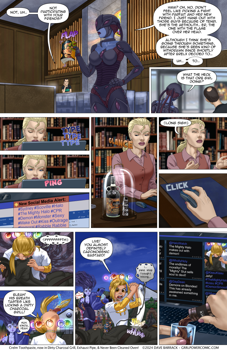
This page is a tad busy admittedly, but I couldn’t resist a little aside back to the base to show Arianna just… aging a little bit each time Sydney’s name suddenly gets a bunch of social media hits. I don’t know why I made her drink of choice roast coffee rum, other than I didn’t want her to be another whiskey drinker. The comic already has a few whiskey snobs in it.
When I look back through the comic, I think the biggest issue with it is the density. Since I want every page to tell it’s own little segment of the story, there’s no big splash pages (except for page ~100 I think, where Sydney gets dropped off at the base for the first time) or larger establishing panels that showcase new locations. The result is that the visual pacing is kind of homogenous, which is to say, dense, cause every page has 9 plus or minus 2 panels, which is really a lot for a standard comic page. I’ve considered trying to draw larger panels on occasion to vary to pacing, but then I’d have to post twice as many page, like doing those tall double pages I’ve used on occasion, in order to have the same amount of story per post. Unfortunately that would almost definitely mean more work for me. Probably not double, but if I used those larger panels for some establishing location shots, it would mean quite a bit more background work, which would benefit the comic I think, but man I am slow at them. And I don’t even do very detailed (or good, if I’m honest) backgrounds. Like look at that first panel. No comic shop has bare walls like that. There’d be posters all the way to the rafters, and there’s be little displays all over the counters and tent signs and all kinds of visual clutter.
Honestly, when I look at those artist that seem to delight in drawing some anime witch girl sitting in front of a cauldron in some shop with a 4 dozen bookshelves and plants and papers scattered all over the place and a bunch of owls or cats lounging in all the nooks and crannies, I’m like… that’s 60 hours of work, right? Drawing all those spellbooks in the shelves, all different heights and widths and some of them canted slightly and the little compasses and vials and jars full of eyeballs or whatever… that has to be like a week and a half of 8-5 work for that one picture, right?
Anyway, that’s why Sydney’s comic shop is really… uh, tidy.
The new vote incentive is up! Crimson and Scarlett have a present for Ingsol!
It’s them, they’re the present. They’ve decided that “Sire-versaries” are a thing and Ingsol has to be convinced this is a good idea each time. Everyone thinks his pair of names-that-are-synonyms-with-red sirelings who are both women and who were both turned in that age range that ensure peak hotness means he’s a dirty old man, but he actually isn’t. It just worked out that way. And don’t forget that while it looks like there’s a 25 year age gap between the girls and him, it’s actually much worse, as he is 700 years old, while Scarlett is something like 180 and Crimson is only 40. But at the same time it’s meaningless as they were both fully adults when they got turned, so it’s all copacetic.
As usual, Patreon has the pair of them in various states of undress.
Double res version will be posted over at Patreon. Feel free to contribute as much as you like.














It’s not that Sydney’s shop is tidy as much as it is that The Mighty Halo’s fan buy everything, including the decorations.
A Batman poster that’s actually hung in Sydney’s shop is much more desirable than a random Batman poster.
I think the main issue with backrounds is that they are ALWAYS in crisp focus. And… they really don’t need to be. Trust me, a handful of passes with different green “speckle” brushes makes a dandy forest. Doing the same with square/round stamp brushes in random rainbow colors will do a FINE comic book shop. The “posters” need merely to be a gradient swoosh with a contrasting (vaguely humanoid) blob. A bunch of books needs a random blotch of colors pulled into a vertical streak.
I think a bit of practice with the “one hour background challenge” might help a lot. And… why limit yourself to exactly one page per update? How about “x panels” per update instead? Especially because you are already working in much larger resolution. Not all panels need to be shrunk all the way down. Some can be left as a larger size. (If this doesn’t wreck your workflow of course)
I legit think he could have organized it and give us two pages with the Swolthulu’s reveal. One big page for just Swolthulu and then the others sorted into a second page update.
Sydney has to be more careful. If two handed fisting started to trend she may have doomed her career. I know his skin is tough but you didn’t have to give him the Captain Kirk.
The real question is why leave your emergency cold brew at room temperature? A nice mini fridge under or built into the deck would do wonders.
you don’t drink most spirits cold
The real danger to 2-handed fisting like that is that she has her fingers interleaved.
It’s a great way to break a lot of phallanges.
#Halo Double Fisting Demons!
She was almost the last woman standing at a sucoff with two succubus. I’m sure that could be worded worse. Halo was the one that ended up trending online at the end.
Peltier cooling block integral with desk/
Except for Champagne, specifically chilled mixed drinks like Martinis and non-British beer, most alcoholic beverages are imbibed at room temperature.
Oh my god. This is the first time in like 5 years that your webcomic made me laugh.
Oof… Public service announcement: Don’t try to perform CPR if you’re not trained. (It’s a one or two day course and pretty easy, so I highly recommend it to anyone) Anyway, if the guy is conscious and talking, he’s obviously still breathing and his heart is obviously still beating; doing chest compressions or… whatever Sydney is doing… is gonna do more harm than good.
Side note: I have seen a video of some untrained idiot attempting CPR on some poor guy who was conscious and breathing and it was seriously uncomfortable and painful to watch.
Between diving certification, ADHD-driven self-education, and Arc-SWAT training (up through Graduation) I think it’s more likely than not that Sydney has proper CPR training.
One would assume so, but what she’s doing doesn’t look like what someone trained in first aid would do.
tbf to her, she prolly wasn’t trained in CPR on demons, especially since “demon” is as broad as, if not broader than, the term “mammal”
The way it looks like, she wasn’t trained in CPR on humans either.
She did get the press on the forehead and lift the chin bit right for rescue breathing. I’d love to dee the ARC First Aid Manual, Chapter 6.6.6 Resuscitation of Non-Human Entities.
The core of CPR is chest compressions – and what Sydney is doing in place of the chest compression ps has very little to with what they actually look like.
It’s a demon with what looks like an exoskeleton, a standard chest compression from a Sydney sized person probably wouldn’t do much
Brelx just looks like having a muscular body, are you confusing him with another demon?
And even if he did have an exoskeleton, what Sydney is doing would do even less than a standard chest compression.
Surely the lighthook would be more effective for chest compression, not to mention less tiring and ‘can be done to several demons at once. Presumably there is a truce with Cthulhu/
I assume he wasn’t breathing or talking until she did her thing.
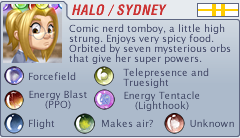
Just a thought, as this is still in the backstory telling. Sidney has not made the rank of corporal yet. So, my question is, what happened to the point that went into the green orb? Also was wondering what would happen if she, in the NEAR future, she put a point into the unknown orb, even not knowing what it did. Would that bring some idea of what it did?
My little bro and a few of his mates briefly had a band called “Unleash the Kraken” formed after a night on the stuff!
From memory, a mix of his old “Monkey Puzzle” and “Faster She Said” groups with a couple of other people involved.
We know Harem is on site, shouldn’t she also be doing stuff to help?
too busy laughing
And posting pics online.
‘#Rabble-rabble’ :lol:
I want to point out that Sydney did NOT induce nitrogen poisoning. She depleted the oxygen in the area. to induce nitrogen-poisoning, would have required subjecting the target(s) to pressure normally associated with deep dives, where so much nitrogen accumulates within the body, it affects brain chemistry. Folks may want to look up Nitrogen Narcosis, and Decompression sickness, aka ‘The Bends.’
Agreed. Nitrogen is safe ish. It’d only becomes a metabolic poison under pressure. Which Sydney should know having gone SCUBA diving.
It doesn’t take much pressure. 10 meters deep (two atmospheres) it roughly starts and you notice from about 40 meters. It can price fatal at 60 to 90 metres. Tolerances vary.
I believe it can affect jet and shuttle pilots pulling high Gs too.
Also there is no reason to strictly keep to the same panel format.
It is not like there is some print editor that forces dave to follow the pane layout.
“Secret “link that show layout, wiki links to backsotry , etc are perfectly acceptable
compare that to xkcd who even included full javascript games in its biweekly updates. Only possible in web updates.
That assumes the author has no ambitions of translating their work to print. The idea of leveraging the web format to present comics differently has been around since at least Scott McCloud’s “Infinite Canvas”, but few authors have explored it over the last 20 years, because it’s more of a novelty than an efficient way of communicating a story.
I couldn’t help but read Sydney’s line in the second last panel in the voice of Hunter Gathers from The Venture Bros.
Good choice of rum.
It’s usually the other way round.
When I was taking my first aid classes, the gruff old man teaching the class warned us there was a good chance the person you were doing mouth to mouth could throw up on us.
His advice on that was to strain out the big chunks and keep going.
I REALLY want that Kraken Roast Coffee Rum to be a thing.
If it is, it’s not on their website.
Dunno if it’s available everywhere but it’s listed on Australian websites like cheaper liquor
Within a day of reading the comments a review of Kraken Rum showed up on my You Tube feed. The Algorithm is watching.
Search for “Kraken Coffee Rum” and it will show up in the Ads.
I can assure you it is real. And it is delicious
I’m not a fan of spiced rum in general, but I do appreciate that when dealing with the Mighty Halo™ shenanigans one needs copious amounts of alcohol AND coffee at the same time.
Plus one!
Hey, nothing wrong with a story doing substance over kayfabe and hype. It’s one of the great things here.
And for Whiskey, Tennessee Honey is great!
Birnie Moss scotch – that will wake you up and warm you up in one go
… If a demon dies.. wont he just go BACk to hell?
That’s not how it works in this setting. Demons are just aliens from another planet, not interdimensional creatures. There are astral planar beings, which are more akin to Old Gods than demons, which the Infernals made pacts with for power.
I thought the comic book store cleanliness was due to initially moving into a _much_ larger space, then actually leaning into the “Ex Church” esthetic, what with the custom stained glass and all: Churches (even modern mega-churches) keep it clean. Your expectations for comic shops has been biased by years of comic shops being in the cheapest spaces they could find, and still barely hanging on. Much like martial arts “studios” being in strip malls in the bad part of town. It’s not to give the students “real world experience” it’s because it’s cheap, and teaching martial arts/selling comics is such a great money spinner! /s
Knowing Sydney was trained in CPR, this sorta gut-check reaction from her is just downright funny. People always seem to look for real world reactions…in a fantasy comic strip about a daffy, wonderfully funny, super girl. Suspend rjine beliefs, durnnit!
“Live! You almost definitely carcinogenic bastard!” may be one of my favorite lines and the funniest line I’ve ever read on this comic.
I’ve now read this page several times, and I keep laughing once I get to that panel. Every single time.
Something needs to be done about Parfait….!
Speaking of backgrounds, I’m actually going to point out something other than the walls. The pipe organ.
So, pipes are going to be in perfectly scaling height when all lined up straight like that. If they’re uneven heights, that’s because there are little decorative ‘towers’ sticking forward (can’t remember the name).The ones behind will be lined up nicely, but the ones stuck out forward will make the overall profile look uneven from a distance.
Arianna needs to stencil “OPEN IN CASE OF SYDNEY” on that glass cover.
NOT just Sydney. She’s got to deal with Harem and Dabbler’s antics too.
Not just theirs, but…y’know, that’s almost proof Ariana is superhuman right there-she’d need superhuman tox resistance to stay sane with the organization she’s running PR for-everyone in it has some wacky hijinks going on (*or will be going on, or has been going on).
She had CPR Certification because SCUBA qualification required it. So if anything “Trained Military Lifeguard Resuscitates Inter(Dimensional or Planetary or Realm) Visitor” yay hero Halo Go Go Go!
Kraken Brand Roast Coffee Rum. When you need a drink AND coffee.
Speeking of backgrounds: The forest is gone. First Aid should be applied immediately on spot and not after 1. dragging the body on a street, 2. calling the ambulance and 3. waiting for the ambulance to arrive.
She’s probably panicking, but couldn’t Syndey just replace the nitrogen in his lungs with oxygen? Unless there’s some sort of limitation of ‘don’t replace/transmute gasses within people’ that might need to be bought in the future for upgrade points.
Although… can she produce/transmute gasses for things in contact with the Lighthook tentacle? :D Clearing the airways, supplying air and intubation in one possibly traumatic (or arousing for the succubi) manner.
CPR Glurk Certification
I don’t know if demon lungs are anything like human lungs, but changing out all the nitrogen in his lungs with oxygen would be a bad idea because of the following: The Earth’s atmosphere is mainly composed of 78 vol. % nitrogen and 21 vol. % oxygen (+ 1 vol. % argon and traces of other gases). Since oxygen is exchanged at the alveoli-capillary membrane, nitrogen is a major component for the alveoli’s state of inflation. If a large volume of nitrogen in the lungs is replaced with oxygen, the oxygen may subsequently be absorbed into the blood, reducing the volume of the alveoli, resulting in a form of alveolar collapse known as absorption atelectasis.
…Is it me, or does that “bioarmor” of Glibph (she at the top of the page) have a design that sort of thematically resembles the giant monsters attacking the Alari homeworld when Sydney was left behind on it?
Is that a hint?
Nitrogen replacing the O2 would made them pass out due to them not being able to breathe O2 long before the Nitrogen could poison them, no? And also, deep sea divers have to take care of nitrogen because with enough pressure it will dissolve into our blood, like CO2 in carbonated water (or soda), and if you dive up from too deep, it will bubble out from everywhere in your body, which can cause MASSIVE damage.
Also O alone? SUPER reactive, that single atom of oxygen DO NOT like to satay alone. Nitrogen just will bond to another Nitrogen because its super stable (that’s the reason why it is inert, and why we can breathe it all the time and don’t disrupt our O2 gathering capabilities).
I think they probably have a lot of background assets that they reuse, either in whole or in part, with some tweaks.
TIL I have the same taste in drinks as Arianna
Been rereading the comic from the start these last few weeks and finally got around to to point where I first found it. A whole big fight plot that I didn’t understand any of the characters or motivations of and when I tried to read back a few pages found an unrelated other plot line going on instead (hence just giving up and starting from page 1)
Surprised it’s only been a couple years since I first stumbled on this comic, it feels longer.