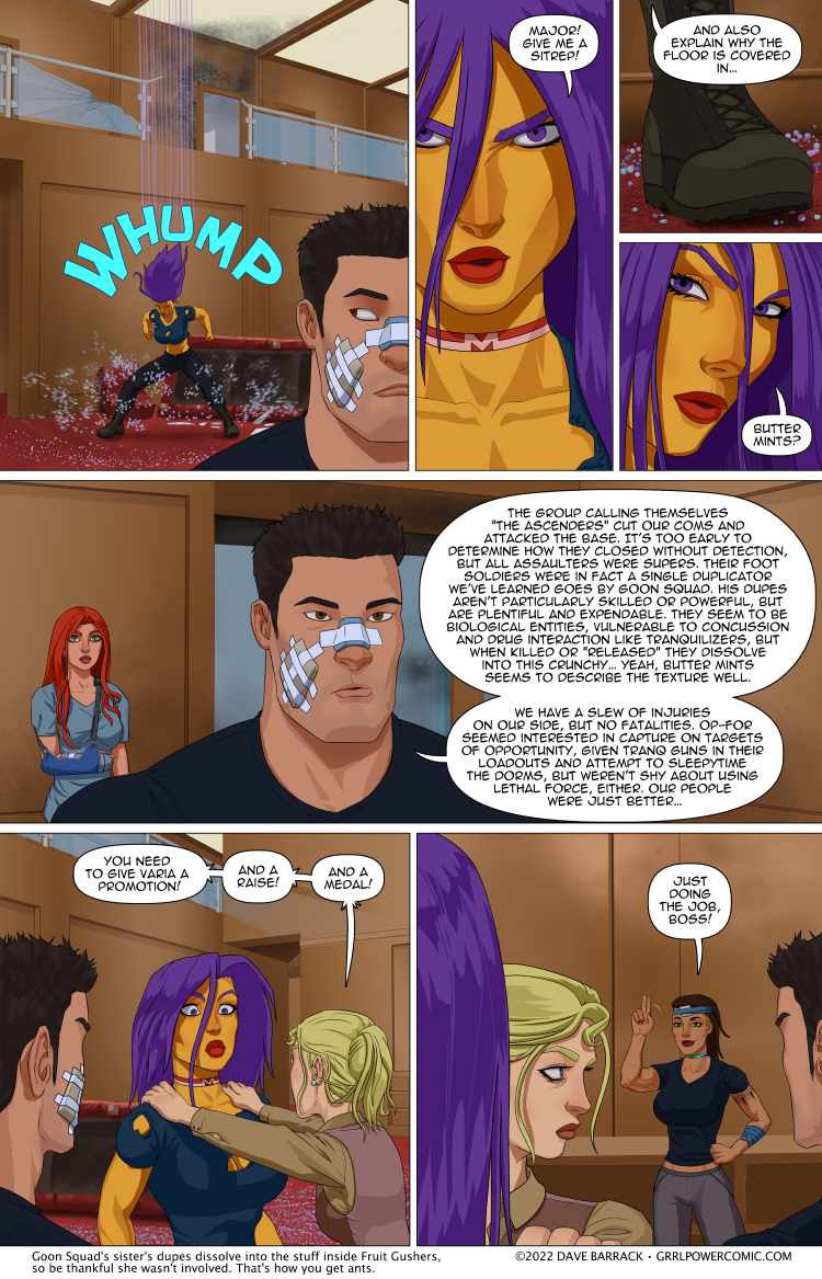
Grrl Power #1087 – Adulation escalation
Now that Arianna has gotten past her “knife hucking reaction phase,” she’s had time to stew in the staff saferoom and really concentrate on freaking out over how really super close she came to losing all of her skin and muscle and bones to a jerk with fire powers. Dr. Frost may have a new patient.
I’m enamored with the idea that Goon Squad comes from a large family of siblings and they all have weird variations on duplication powers. I already joked that he had a brother named Brute Squad who can make far fewer dupes than Goon, but they’re much bigger and stronger. Maybe there’s a sister named… I dunno, Fruit Squad? Or Fruit Ninja. They don’t all have to be Squads necessarily.
You may notice this page has slightly simpler coloring than usual. I mean, maybe some of you wouldn’t right away, I personally can get pretty engrossed when reading and can miss dramatic shifts in art style sometimes. Anyway, I’m out of town for a few days because I’m going to go see Rammstein in concert. The wife got tickets for a 2020 show, but as you might guess, it got pushed back, twice. Normally taking a few days off wouldn’t affect the comic because I do have a tiny buffer, but at the last minute, I decided the page that I’d originally intended to go here would be better if I put it off for a few pages, because otherwise it’d look like Maxima’s trip home took like 6 hours or something, which it definitely didn’t. So I find myself in the odd position of “finishing” a page then almost immediately posting it. I’d like to say I’ll come back to this page and finish the coloring work, but I kind of don’t hate the way it looks? Hiro’s block of a head is a little plain looking, but maybe a quick highlight pass would help. Doing the shading like this took like, and hour? For this page and the next one. And some of that time was trying to keep myself from going in with the blur tool and really smoothing out those hard cell shade lines. Normally it takes all day to do all the foreground coloring. I don’t want to make a bunch of sudden changes to how I do the art though, because that’s jarring to read. Although, if I started a new storyline and signified that with a chapter splash page then I could justify experimenting with the art a little easier. It’s still be jarring, but it would be encapsulated.
The September Vote Incentive is up!
Thank you guys so much for your patience. I hope it was worth it. It took a lot of research online to find just the right references for this piece. Toil toil. :D
Double res version will be posted over at Patreon. Feel free to contribute as much as you like.





Goon Squads personal or family pet could be “Platypus Platoon”.
But it might also be “Anteater Army”.
Definitely enjoy the more comic-y art. I’ve not been a huge fan of the lens-flair effects of shiny on all of them, so going back to colors like this are definitely my preferred.
I also enjoyed the different art. “Great Shades of Saturday Morning Cartoons!”
Not wild about the coloring – too much has been made of Maxima’s shininess.
And it sounds like Arianna is letting her opinion of Varia be influnced by the fact that Varia saved her from a particularly nightmarish death.
Nightmarish death is in fact nightmarish and deadly, I think that not experiencing it is a great excuse for her state of mind right now.
If this takes, like, 8 times less than your usual process, than could we get this style and another page per week =P?
(I don’t have anything against this style even without another page. But a page would be cool =P)
Or he could build a buffer up.
Buffers are good.
Wouldn’t Harem already fit the bill for Goon Squad’s sister.
Female, check. Duplication power, check. Code name that has to do with a group of people, check.
Harem is not duplicating in the same way. Plus she doesn’t dissolve into anything when “released” (un-teleported). Also, her powers are quite different in that goon squad’s dupes are “not particularly skilled” whereas all of harem’s “dupes” are equally skilled supers (teleportation). Finally, it seems that she has exactly 5 bodies to “play” with. She can un-teleport some of them, but when re-deployed, they retain their physical form at the time of un-teleportation. That’s quite different from “duplicating”.
I’m going with Loon Squad and the much more terrifying Goose Squad
Oh, the humanity!
Or O.D. Humanity. For the one whose duplicates leave copious amounts of drugs.
I thought something looked a bit “off” about this strip. It felt more 2D compared to the 3D feel of the usual strips. Put me in the camp, that’s apparently pretty small, of liking the other, more detailed version.
TBH I’m with you on this one.
Same. It’s a jarring change, and not a jarring improvement. Don’t like the matte at all. Went from looking like a comic for adults to one for kids in one page.
I noticed the difference in the art style, and it makes sense it was faster. I like it and would be completely happy if you continued like this from here. Save your crazy adventures in foreground shading for the vote incentive and occasional post on the Patreon feed.
I like the simple style. However Max’s ‘special’ skin I don’t believe is done justice in the long term.
This coloring_style can not ^visually^ do Maxima’s skin ANY justice at ALL !
Have fun! It’s been ages since I went to a concert, I believe it was the group “Yes” back in ’83. I like the color style too reminds me of the early days of the comic and I’m sure it saves a ton of time and effort for you as well. Arianna will need to see Dr. Frost, I remember the first time I got caught by a back-blast even with the gear it was hot! Any tiny gap in the suit was burnt. Wrists, ankles, and neck got the worst of it. But now Vari has a new best bud for life! I wonder if she’s going to have a problem with that, time will tell huh.
Maybe “Cheerleader Squad”, whose duplicates have super agility and flexibility, but aren’t particularly strong.
they’d be strong enough to lift a team of themselves into a pyramid
The ever popular “Bimbo Squad.” Very popular. Thing is more duplicates there are, the ditzier they all become. And the easier they are to seduce. Half out of action due to pregnancies which prevents recall and maintains brain drain.
Instead of One Brain controlling multiple bodies like Harem, It’s one brain DIVIDED among multiple bodies, eh?
Ariana’s reactions here remind me of what happened when the new hire I mentored on a somewhat unpleasant contract escaped said contract by becoming my boss. I didn’t get a promotion, but it was a nice raise. Also, I think it was more of a plastic than a medal.
I like this style WAY more actually. It gives it a unique charm
I like the more detailed art, sure, but I also don’t mind the less detailed art. I’m of the opinion you can cut yourself a little slack. This comic started with simpler art, it can afford to take a step down from the almost *too* good looking art especially if you need the rest. Also you can save the major work for pages that involve that extra detail or reflectivity, major splash pages, vote incentives, and incredible shots that warrant the extra effort, max wasnt drawn super reflective in the early panels until it was used to establish something or make a joke,. Like dabbler playing funhouse mirror or Sydney catching fire. A simple conversation in a hallway doesnt need those pixel perfect panels. Heck early panels had chibi jokes sometimes which were still epic
Although I never served in the armed forces, I have been in several situations in which a “sitrep” was necessary. I would give my left testicle for the type of concise summary Hiro gives.
If I were him I would start with a short statement about the immediate situation. Something like “We were attacked, we won.”
Did they win?
Remember, the guy outside said the attackers were just a distraction.
What was the real target?
Where’s everyone else?
They know the name of the attackers, so it sounds like they didn’t lose
Unless everyone else is dead
Personally, I think I like the flatter colors. But that’s just like, my opinion, man.
He needs to have a sister who is annoyingly bubbly and goes by Cheer Squad.
Where it really shows up in the coloring is Max’s skin. How extensive the effect is varies page to page, but you usually do a really good job on the specular and reflective/metallic aspects of her skin, and when that’s gone in a panel that’s not really low light it’s pretty obvious. For everything else, throw in a small hair highlight or two, and maybe a bit of specular on Hiro’s face in the middle panel, and I think I might have not noticed the difference, or at least not right away.
Came here to say this. This!
Not going to lie. I feel like the simpler coloring work better with the art style you’ve been playing with.
I’ve said it before- I rather prefer this style of coloring. I think it’s perfectly fine to have super high fidelity heavily rendered pages for big splash bits or whatever, but I still think the meat of the comic ought to be simpler, so it can be more easily read and absorbed.
And also so it’s easier on YOU.
So, how long until someone tastes one of the “butter mints”? Someone will find one in a couch and when no one is looking… eww, that’s not a mint!
With regard to the concert. Rammstein, totally worth the wait. My last concert was probably ten years ago. Took my son to see Alice Cooper.
it just dawned on me that when Varia touched Sydney that there was no effect, but what would happen if Syd were to be holding an orb? just a question.
There WAS an effect, just not an obvious one.
The orbs started orbiting both Varia and Halo.
Varia is the only one getting this effect from the orbs when touching Halo (so far).
But yes, I would definitely like to see Halo hold an orb while Varia is touching her.
P.S. If we use Xochitl’s codename, then we should be using Sydney’s codename too ;)
It’s much easier to remember Varia’s super name than her real one. Same as with Harem.
There actually was an effect when she touched Sydney. Its just a tad subtle and one needs to look carefully at the details to see it.
;)
There actually was an effect. If you look back at the page where they touched, you can see Sydney’s orbs spread above both their heads, implying that Varia would be able to use Sydney’s orbs.
As for my opinion on the comic style: I quite like it, especially if it would make it easier for Dave to draw the comic. I’ve seen him say a couple times in the past that the really long time it took him to draw the comic was the main thing that prevented him from going to 3 updates per week. And as for Maxima’s skin, which is something I heard mentioned a couple times: Back during Sydney’s birthday party, Max got that special choker which would change her skin tone. You could probably use that as an excuse as to why Max’s skin turned matte.
This style of artwork reminds me of a 60’s Saturday morning cartoon…love it !!!!
‘Fruit squad’ would drive the woke crowd mad…love that too ;)
But how about she specializes in one sort of fruit, the ‘Banana Brigade’
“Right then, come at me with a banana”
I consider myself on the same side as the woke crowd, and Fruit squad is hilarious.
Now I’m thinking of a Super called Alphabet Soup who can change their orientation at will: Instead of mass attracting them as gravity does to the rest of us, they are attracted to whoever they are attracted to.
Backstory: When their power first manifested they were looking at their then romantic interest flying away on a plane and he was launched up by his longing. They quickly realized that what they really loved was solid ground.
And a training montage of them learning how to be attracted to anyone and anything, with some hilariously inappropriate mishaps.
OR magic pockets. Anything a Duplicate shoves into a pocket can be pulled out of a pocket by another duplicate.
Their costume includes a jacket that’s really just a massive pocket big enough to shove people into.
Everyone who comes out of the pocket has a different, vague description of the hellish nature of the pocket Dimension.
Okay i honestly love this art style. I honestly hope this keeps up because its really nice to look at. Though the tumblr noses are..a thing.
While I do feel like a few things like Max’s skin could use another detail pass, on a whole I don’t really dislike what we’re seeing here. You’ve been trending towards an almost hyper-detailed look for the past few years, and in some cases it’s actually made characters look much uglier. I really rather liked the more traditional “comic-y” look of the earlier years of Grrl Power.
Not sure from Hiro’s summary whether he’s aware of the attempt to Breach Zoeng’s office or not.
There will be a debrief of all involved personnel by Maxima and General Faulk, after which commendations and awards will be determined.
Doc Chevy: Yeah, I treated almost all of our people that were on the base at the time. 8 of them qualify for a purple heart.
Maxima: [ Reviewing video surveillance of Doc Chevy in action ] What happened to this one?
Doc Chevy: You know how I have the ability to heal people and not just with medical skills?
Maxima: Yeah, sort of like Cure Moderate Wounds.
Doc Chevy: Well, when I get angry, I can turn it around to Cause Moderate Wounds.
General Faulk: Well, next time you do that, try to not make such a mess.
Sydney: I leave the country for a day or so, and you end getting one of these awards too? Welcome to the club.
I noticed the different coloring immediately, and I rather like it. If I have a vote, I vote for “if it ain’t broke, don’t fix it.” I’m not saying you should change it forever, though I wouldn’t protest.
But that’s just me.
I like the art on this one. It looks a bit more stylised. The only downside is that Max no longer looks golden, she just looks like a Simpson.
It doesn’t actually make her look ^like^ someone from the Simpsons, but it DOES make her skin look like it has the same yellow-ish pigmentation (rather than the shiny/glossy “gold” of her ^actual^ skin color)
Other than that, I’m kind of inclined to agree about the art here.
I kinda dig the shading, it’s like classic Saturday morning cartoon. I do miss Maxima’s sparkliness, though.
Adhd brain skipped over “the stuff inside” and just to fruit gushers, so for a minute I thought it was a Homestuck reference…
I kind of like the simpler art style, I think it’s because it lets my brain to fill in the blanks more. Like I think this is a personal problem but with the more detailed art style things play in my head like mediocre CGI and with this less detailed it plays more like a cartoon
The different coloring looks very 2d and stiff. If it was just for quick replacement comics or when there is a problem it would be fine but as the new standard style it would just be horrible.
Fruit Ninja – Makes clones similar to Goon Squad, but they wield deadly fruit. Also, the less of them there are, the more powerful each is. Because everyone knows that the final ninja is the strongest one.
I like the more cartoony, less “realistic” shading honestly. I feel like it’s much easier to see relevant details in it then when everything’s all shaded up. Especially (for example) in that first panel—in the full style, I doubt I would have been able to pick out the broken glass, Fire location, or that the “butter mints” weren’t actually just a motion effect. Also, it lets weirder proportions and faces be more funny and less creepy.
I suppose Macima could be a bit shinier though.
Cob Squad: She makes doubles up they are all creepy scarecrow versions.
Clown Car: Can make up to fifteen doubles, but they are all clowns of various sizes and genders and each actually represents different one dimensional personality traits
Death Squad: despite this intimidating name and the ability to make a hundred doubles, with each new double erasing a previous one in a cloud of dust…these doubles are all corpses, like just meat and clothes and whatever Death Squad had on his person. A useful power for getting extra equipment…or meat if you are starving on a desert island.
Ninja Death Squad just goes after people who make bad puns.
Fanbase: can create duplicates of themself but of the opposite gender, these duplicates however are obsessed with the original like a total “fanboy/fangirl”, however while a few them are just like groupies or regular (oh my god you are so cool) fans, the more that are created the more *unstable* they are, after a dozen or so turning downright sexually predatory and rage fanatics *I got their left shoe*, *give me a baby*, however they have never actually done anything with the duplicates as they look too much like their own real sibling or parent when they were younger, and its just creepy. Luckily they can make them all vanish by saying “shows over” and snapping their fingers…however some of the duplicates seem to have memories from past duplicates; compared to characters in a dream as subconscious projections.
Honestly? Really like the more poppy color style. Both it and your normal style are good, but I feel like the harder delineation on the colors works really well for your general art, with the one 3/4 head turn Max probably being one of my favorite versions of her you’ve done yet.
Super-detailed coloring can be great, and if that’s your preference I won’t complain at all, but don’t feel bad if you stick with this for a while either. It looks fantastic :)
Are the ladies of ARC Swat disappointed that Hero still has his shirt and pants on?
I did notice the art change, but figured was a good reason for it. Rammstein qualifies as a very good reason.