Grrl Power #1087 – Adulation escalation
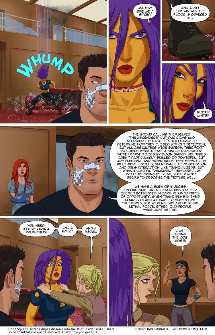
Now that Arianna has gotten past her “knife hucking reaction phase,” she’s had time to stew in the staff saferoom and really concentrate on freaking out over how really super close she came to losing all of her skin and muscle and bones to a jerk with fire powers. Dr. Frost may have a new patient.
I’m enamored with the idea that Goon Squad comes from a large family of siblings and they all have weird variations on duplication powers. I already joked that he had a brother named Brute Squad who can make far fewer dupes than Goon, but they’re much bigger and stronger. Maybe there’s a sister named… I dunno, Fruit Squad? Or Fruit Ninja. They don’t all have to be Squads necessarily.
You may notice this page has slightly simpler coloring than usual. I mean, maybe some of you wouldn’t right away, I personally can get pretty engrossed when reading and can miss dramatic shifts in art style sometimes. Anyway, I’m out of town for a few days because I’m going to go see Rammstein in concert. The wife got tickets for a 2020 show, but as you might guess, it got pushed back, twice. Normally taking a few days off wouldn’t affect the comic because I do have a tiny buffer, but at the last minute, I decided the page that I’d originally intended to go here would be better if I put it off for a few pages, because otherwise it’d look like Maxima’s trip home took like 6 hours or something, which it definitely didn’t. So I find myself in the odd position of “finishing” a page then almost immediately posting it. I’d like to say I’ll come back to this page and finish the coloring work, but I kind of don’t hate the way it looks? Hiro’s block of a head is a little plain looking, but maybe a quick highlight pass would help. Doing the shading like this took like, and hour? For this page and the next one. And some of that time was trying to keep myself from going in with the blur tool and really smoothing out those hard cell shade lines. Normally it takes all day to do all the foreground coloring. I don’t want to make a bunch of sudden changes to how I do the art though, because that’s jarring to read. Although, if I started a new storyline and signified that with a chapter splash page then I could justify experimenting with the art a little easier. It’s still be jarring, but it would be encapsulated.
The September Vote Incentive is up!
Thank you guys so much for your patience. I hope it was worth it. It took a lot of research online to find just the right references for this piece. Toil toil. :D
Double res version will be posted over at Patreon. Feel free to contribute as much as you like.
These comments have really become boring echo chambers repeating each other on art style or concerts.
No one seems to care anymore or wondering about the plot directions. Has everyone forgotten the person holding back outside and mentioning their “real” target that none of defenders were aware? Is anything or anyone missing? The sitrep doesn’t mention areas that were not directly attached. If the invasion was a distraction, what was the real target. Inquiring readers want to know.
Well, they know the name of this group, so they have to had captured someone alive
Mentioned that already, but you must have missed it your effort to bash people talking about DaveB‘s real life
Well, the last fight we saw where ARC was *losing* was the good doctor and his Shen Wei getting AOE-ed. Since he’s not in this strip I’d assume starting there.
Harem isn’t in this strip either, so she must be dead as well, right?
or they learned the name when they captured the swan boat before and have been investigating this group ever since.
and on the conversation going on about deaths, this strip literally says no casualties on Archon’s side. It looks like Maxima showed up after the conflict had been taken care of.
Wouldn’t Maxi already know the name then?
plot hole.
But yeah, this is the same group as the Swan Boat, and pretty sure there were arrests. So curious as to why Maxima had no briefing on the people that abducted one of her subordinates.
Plot schmott. Om mostly here for the jokes.
As a Corpsman, I am instructing you to take a Motrin, and one large Chill Pill.
After that, you should have a seat, and focus on controlling your breathing – and outbursts – until the Pill takes full effect.
You’re welcome.
Well whenever I point out the time frame of Sydney starting the story as a Corporal and the fact it was 3 months ago to get to that section, I am told to F off as the DaveB simp squad all come out telling me I should not ask questions of their lord and master. 1086 issues later and we have yet to join the start to the current.
How edgy and provokative. By teenage standards.
Not even.
This is “edgy & provocative” by the standards of “teenagers written by the CW.”
I ABSOLUTELY LOVE the new art style! Feels very much like the show Gargoyles or like an anime. It works extremely well for the comic I think. And you could always have Maxima be the only one to get the shiny treatment, thereby enhancing how shiny she is supposed to be. Sort of like when a single item is colored in a Black and White film.
Yeah, I’m a fan too.
And that buttermints panel. *CK*
What about Flash Mob, whose dupes appear naked? =p
Given the nature of the comic, yes, that’s the sister
Someone give this guy a promotion, and a raise, and a medal.
Nope.
Cheer Squad.
The family is an upper middle class WASP nest, and Cheer works hard at deliberately remaining ignorant of her brother’s shady shit. I expect she’d ultimately turn on him if confronted with undeniable evidence, but until then, she _really_ wants to believe that their not Bad People.
Like most upper middle class WASPS.
Are you suggesting that families being willfully ignorant of one member’s criminal activity is something only well-off WASPs do? Because every gangbanger here in NYC has a momma that swears their baby is just hanging out with the wrong crowd, but they are really good at heart. Every time the news shows the face of the perp in some subway assault or bodega robbery, nobody has any idea who that person could possibly be.
No theyre raised by a single mother that carries a rolling pin called Ma Squad. Like Ma Beagle.
Rolling pin? Or a jandal (‘flip-flop’ for Americans, or ‘thong’ for Aussies)
You keep misspelling chankla.
No, aboo, I am not.
That is a completely different f’ing sentence you just introduced, and has exactly nothing to do with my statement.
But I find it instructive that you are implying that “gangbanger” and “WASP” are mutually exclusive labels in a shared category.
Tell us, aboo, what category do you think “WASP” and “gangbanger” both belong to.
” she _really_ wants to believe that they’re not Bad People. Like most upper middle-class WASPS.”
Is a pretty clear statement that most upper middle-class WASPs are both Bad People and in denial about it. It’s not a different sentence at all. It is also pretty clear in singling out upper middle-class WASPs for criticism and scorn.
In the category of “Humans” gangbanger and upper middle-class WASP are not mutually exclusive but have a very very small overlap. The examples I used highlight the fact that families of Bad People (of all races and classes) are almost all in denial.
Flash Mob is a character ib Narion Harmon’s “Capes” universe {which crossed over with Grrl Power in the book “Teamups and Crossovers” – see sidebar}
Goon Squad here…the
So many comments… no time table.
Everybody’s been treated so it’s obviously post 1h. Assuming Maxima got the message at the same time it was sent she did not travel at the speed of yes and went maybe Mach 14. Possibly up to 20 if the message system is delayed because continental lag.
The simpler art style is kind of a relief. Maxima could use some highlights to make her look more golden, and less yellow. Other than that, I prefer this style.
Can I just say that I LOVE this crisp artwork, and clear style?
It looks AWESOME and much better than the regular one these days.
We really don’t need reflections in Maxima’s skin to be sold on the idea she looks like polished gold.
I agree! She could be a bit more gold, if only because the overly matte style reminds me of Maximuppet, but this style is very easy to read through
Support squad, weaker then Goon but just as numerous so gets stuck doing all the ad-hoc such as driving, cooking and etc.
Covert squad, About as strong as Goon but only as many as Brute. Unique because they can make there dups look like other people not just themselves allowing them to go undercover.
Can not really think of anything else right now.
I hope he has cousin named Toon Squad that burst into Confetti and Streamers!
Nah, Toon Platoon, and when defeated they just “Fall down” with stars or birds or something flying around their heads for a few minutes. (Works just like the “Toon!” Roleplaying game, and yes, that’s a thing: https://pictures.abebooks.com/isbn/9781556341977-us.jpg )
I haven’t played Toon is FOREVER! X’D
I was a little yellow cat that typically had hypnosis powers, and a once-per-session gaggy bag in the form of a pointy green hat (that matched his green tunic. He lived in a giant mushroom house in the woods, never spoke, communicating only through expressions, gestures, and writing.
I remember that the narrator at one point had us escape the Mad Scientist’s Lab, tumbling through a Teleportationator Causeway, and our next episode was in an Old Western Desert Town. Everyone commented on how out of place the stock wizard looked, so I pulled my hat and tunic inside out, them into a gambler’s hat, and a vest & coat.
…none of which is super important, but you really hit my Nostaliga button. ^_^’
Y’know, perfectly happy to go down to great art 1/3 days if it meant 3 updates a week :)
Don’t do that.
It isn’t fair to Dave to ask for more work.
I’m not asking for more work. I’m saying that he puts a LOT of effort into his strips, such that he only updates 2/days a week. If putting in less effort on a strip allowed him to put out two lower-form strips, like today’s, AND a normal one, I’d be all for that. We could even get to contrast the different art styles, and the story would move along faster.
If he can’t do it, or had to go three lower-form for two higher, I could live with that, too.
i prefer the new colouring style – the old one kinda sits at the edge of uncanny valley
It’s creepy and uncanny, and Dave’s inconsistent rememberings of relative sizes/heights and actual face shapes are more glaring than when they’re more flat.
Kinda reminds me of The Beginning of the Comic. It did catch me Off guard, But I like it.
I think saving yourself more effort on the coloring for the non-glamour/action/pinup shots makes sense, you don’t wanna burn out on all-day coloring. Save yourself more time for the pages that have something truly spectacular that you can justify spending more time taking more care with panel-arranging and getting plot and dialogue and pacing in a way that satisfies you more, and time for biiiiig even higher quality single panels or splashes or whatever, or simply use the additional time to get more backlog. Do what you feel like you ought to or want to or need to, you know? I do wanna say imo that a lot of the normal panels felt over-rendered before, so I think you should reallocate the efforts probably.
On a topic from the comments last page, the legalities of a humanoid Beholder (the Beholder being one of the copyrighted Dungeons and Dragons monsters), I looked into the humanoid designs and offshoots others did of them and are legally safe.
Okay, so apparent Dungeons and Dragons its self as far as I can tell has not improved on its own Beholder-Kin since the early 90s, as the only humanoid Beholder I could find from them is the same ugly shaved and headless dwarf design with an eye and mouth in the torso and a spare tentacle. A Lensman
https://forgottenrealms.fandom.com/wiki/Beholder?file=Beholderkin.gif#Beholderkin
and a newer addition, Abrethegal, a rather ugly humanoid sort of Beholder
https://dmdave.com/abrethaghals-beholder/
Now there also appears to be a semi-popular *blank page from the back of the Monster Manual* that is really just a Medusa with a Beholder for a head or eyes on the end of tentacle hair, usually a monster girl design,
-this link is one of the few of this I could actually find as a proper link and not a forum page or something
https://d.facdn.net/art/ravenscarlett/1386554832/1386554832.ravenscarlett_behold.png
but moving away from just fandom to something marketed, we go to the Monster Girl Encyclopedia. Which calls their version Gazer (fun fact there is a Beholder sub-species called this but its not copyrighted to this world).
-Note NSFW, the very premise of Monster Girl Encyclopedia pretty much is every monster is a hot woman after man juice.
they also make it a cyclops, but a sort of ghostly eldritch horror whose whatever that is the humanoid body sticks out of has tentacle eyestalks.
https://cdn.donmai.us/sample/f2/c2/sample-f2c24a02b9805187f5c5ff1463d7ac59.jpg
and finally, one that just straight up calls their humanoid a Beholder…but lower case beholder. Monster Musume series. (I don’t know if one has shown up in any of their anime yet though). There’s is also a cyclops, but the mouth is the entire humanoid torso and has “hair” eye stalks. *Note I am so dissapointed at how lazy a design the mimic is though; there are so many creative mimic monsters out there and this series just has clown fish and anemone…so a monster girl hanging out inside a regular Dungeons and Dragons Mimic.
https://i.pinimg.com/originals/df/d9/fc/dfd9fc79736d8b75c841fdb850b03e47.jpg
i contribute to the patreon because of the humor (i’ve fallen out of my chair laughing a couple times). the art style was good on strip one but has also improved since. the coloring i think is fine here but i’m not a fan of the full rendering. it feels a little too shiny. so maybe glam it up a notch or two from here.
Honestly I kinda dig the stripped-out look as an art style. Could stand to see it come around, albeit with some specularity back in Maxima’s cheeks perhaps
I think that Dave could reserve the really detailed for the vote incentive and special scenes. Maybe a hybrid. A little more detail to this if wanted.
Otherwise some of the characters have changed quite a bit in the last few month. Deus and max were a bit odd recently, for instance. Here Maxima actually looks more like she has in the last several months.
Honestly I think this style works for this page. My initial thought was “shit just got real. Home was attacked.” And using a NOIR style to highlight that was fitting choice. Max lost control of home, home was attacked, thus losing the super shine for us readers brings that to bear. I guess the same effect as seeing a retired super star at walmart using a food stamp card and still having to take items off to make it affordable. Vulnerability, like us.
This page is a test for the upcoming cartoon series
A little matte in my opinion.
There needs to be one more pass, at least, to make things that should be shiny, shiny.
A new Netflix Animated Original.
I would immediately subscribe for that.
Seconded.
Here to echo other people that I actually really like the look of this and would love to see more! If your usual style makes you happier of course stick with it, but as an artist myself I get how tiring/time consuming full renders can be.
Honestly, I say stick with this style. The simplicity of it actually makes it stand out a bit more and looks -great-.
Smooth, elegant lines and hard edges for the shading to make fine contrast and draw the eye as the characters pop off the page…
Gives me an idea for another fashion line. NINJAS! Assemble!
Yeah, it stands out… like half of the current webics
Can I just say that I LOVE this crisp artwork, and clear style?
It looks AWESOME and much better than the regular one.
We really don’t need reflections in Maxima’s skin to be sold on the idea she looks like polished gold.
So, would Fruit Ninja follow the law of conservation of ninjutsu?
Don’t hate the art style, but Maxima looks really wrong without her usual shiny color. Maybe a brighter yellow would work?
Goon Squad’s sister is Flash Mob: she can produce dupes, but can’t reproduce clothes, so you end up with a mob of naked dupes.
What? No. They all break out in spontaneous dance numbers at awkward moments, startling all the passers-by!
There’s no reason it can’t be both. Need to create a box of clothes were she’s making a mob.
No dialog…. No Who’s Who.
Heatwave: “That’s not fair! And my arm really hurts!”
And of course their younger brother, Geek Squad…
Oh wow! I didn’t noticed the art style until they pointed it out in the undertext. XD Goes to show when ya get caught up in it you can miss that stuff. Interesting!
Personally, I kinda felt like the art style of this comic had been going too realistic over the years. Far be it from me to say your art is bad, it’s fantastic, but I feel like the flat, toon-ish look better suits a superhero comic. I would absolutely be OK with this being the standard going forward.
Spoiler warning * once you see it you can’t not see it. *
In panel 6, Arianna totally looks like a Hobbit.
Personally I prefer the normal art style. This one isn’t bad, but your normal art is just amazing. Of course it is entirely possible (and probably even likely) that I would just get used to this art style, but when I first saw this art I was worried that something had happened to you.
Regarding the shading, I feel less-is-more can apply here.
It’s definitely a style choice, the characters themselves are fundamentally stylized, not realistic. So, it follows that a more stylized approach to shading can fit as well as the blurred/realistic shading you’ve been doing. As they say, work smarter, not harder.
If you do go for the encapsulated arc with a style shift, I wholeheartedly look forward to it.
I probably would not have noticed if we hadn’t been used to having so much more gradual shading (admittedly superior imho) in the rest of the comic. The artwork is great regardless.
Why does Varia have a bandage on her head and not on the back of her hand?
Good catch. I’m assuming there was an additional injury afterwards which explains the head, although the other bandage should be on the back of her hand when she was in heat-sink form, not the arm/wrist.
Perhaps her landing in the safe room wasn’t as graceful as could be.
Chir is talking about Varia, not Arianna.
Varia should have an injury to the back of her hand where she was shot and ‘dented’ when she was a heat sink. But instead, the bandage is on her wrist and one on her head. It’s possible there there was another shot at her that hit her head duringg the heat sink mode (when she was covering her face with her hand) but it doesnt explain why there ISNT a bandage on her hand, but is one on her wrist.
Yes. I realised that just after I hit the ‘Post Comment’ button.
Colour me embarrassed.
I’m guessing Dave forgot to check and goofed on the bandage location, OR the hand got healed and she had another something on her arm.
Hey we also went to Rammstein on the first leg of the American tour . Yep 2 years waiting for the concert were totally worth it
I rather like the simpler style. It’s crisper, cleaner.
But of course you will do as your muse and circumstances direct. We all do.
Arianna really looks different in this page.
So what about Captain Cape Flourish going after the director? They’re talking like everything is settled but that fight didn’t look very settled. Did he get offscreen’d?
Suicide Squad. Makes clones that explode when they die.
think I’ve fought a few video game enemies like that.
Goon Squad’s most annoying sibling Geek Squad each new dupe is smarter and more arrogant than the last and when killed/unduped they dissolve into D4s.
Any comments on Maxima’s reaction (to Arianna) in panel-6?
Alas, I believe that “Hench Wench” has already been taken.
At least another brother and a sister, idk what the sister’s gimmick would be but everyone thinks she’s Cleanup Crew when that’s actually the super manly looking brother who can make cleaner clones
Laphroaig and Glenfiddich. I like Max even more as a character now.