Grrl Power #10 – Play to Your Strengths
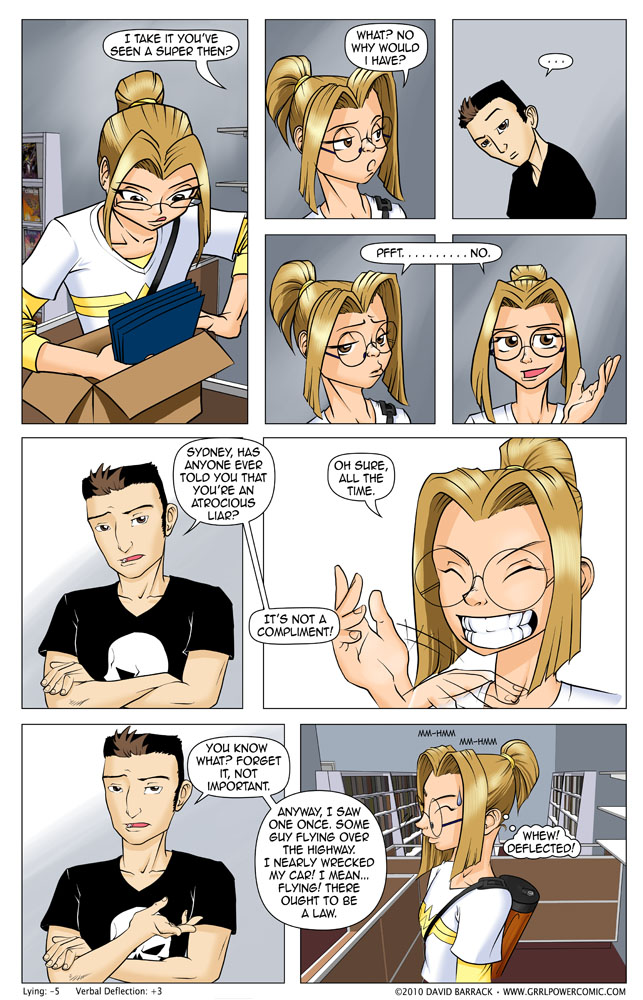
One of the big challenges an artist like me faces when moving from pin-up type work to sequential stuff (besides people doing stuff like sitting and backgrounds etc) is expressions. I’d never had to draw “nonchalant” which is what Sydney is trying to do in the 4th panel. “I wave off your concerns with the position of my eyebrows!”
This page is considerably older than the few preceding it, part of the problem of having built a buffer over the course of 2 years and then when I start publishing, interjecting new pages here and there. That won’t happen as often as I get more confident in my ability to produce these in a timely fashion and let the buffer burn down so that I don’t have quite as much of a lead on the story.










Thanks for trying to bring in some aspects of realism to your superhero offering, at least so far in the various hypothetical situations we’ve seen. Also, I don’t know if you’ve seen it, but that thing about transparent forcefields not blocking lasers was played straight a few months ago in one of the X-Men comics, where Hisako Ichiki (“Armor”) was injured by a laser blast that went through her otherwise quite protective forcefield, since its transparent. I was glad to see it there. On the other hand, in real life, the ability of a substance to block or not block light is frequency-specific and there are many visible frequencies, so it just depends when the laser and forcefield work on the same frequencies or not.
Of course there are a lot of ways that something transparent can block light, especially in a super powered world, (and you know that’s going to come up in the “real” world of the story) but yeah the general idea of my story is a much more realistic take on super heroing, while hopefully still leaving room for wacky comedy on occasion.
Hmmm… I’d like to see your effort on a non-transparent force field G
To put that in perspective, glass is transparent to visible light, but its completely opaque to Infrared.
Hi Liz!
I discovered your comic through your comments on the Webcomic Alliance website!
I like your comic so far, I’ll keep following!
Cheers
PS. See? My gravatar picture is showing up here :)
David, please accept my apologizes for calling you Liz…. I was replying to multiple thread at the same time… need coffee…..
So it is. I was messing with my Gravatar settings, I guess it took a while to get it configured right. Now I need to take some time and set up the stylesheets for the comments section so it looks a little better.
No worries about the wrong name, I appreciate the comments and am getting a lot out of Webcomic Alliance so far.
Hey everyone I’m just replying to myself here so I can see what it looks like so I can mess with the CSS file later. And I kind of wish I could figure out how to set up a dev site so I could do all this without breaking the live page. Oh well. One day I’ll be rich and famous and hire someone for that. Or I’ll just figure it out myself eventually.
Got to get the deflection timing better, or just side step that question.
Welcome to the world of comics! Good to see what you’ve got started here. First off I have to say It’s good to see “Gold Digger” on the comic shop shelves. That comic doesn’t have the widespread readership it deserves.
Secondly, I look forward to seeing more of this comic, though I probably won’t visit regularly until you have a larger number of pages posted. Sure I’m good with a weekly update schedule (one of my previous webcomic attempts was weekly) I’m just not invested enough in this story enough to stay around for weekly updates. As a little suggestion, you might want to find a place to stop to build up a big chunk of content to post and then return to weekly submissions.
Thanks! And yes, Gold Digger deserves the top shelf IMO. I know the sweet spot for web comics is 3x a week, but I’m not a fast artist (yet?) and I’d rather have schedule and stick to it than over promise and under deliver. I wish I could knock out one a day, and I do have some ideas on how to do some additional content. So it’s not ideal but at least I’m getting it out there and eventually I’ll have a nice archive, in the meantime hopefully people will at least bookmark it or subscribe to the RSS and remember to check in every once in a while. And eventually I’ll get faster and everyone will be happy. :) Thanks for stopping by!
I’m checking out your comic for the first time, and I like it. One technical point: it would be easier to read through all your past comics if there were forward arrows at the bottom of the comic. Right now I have to scroll back up each time I read a comic to hit the forward link.
Yup, I thought I had that in but I see it’s only on the front page, not in the archive, which is really the only place it’d be useful. I see if I can figure out how to get it in there.
A few CSS tweaks and there you go.
I find what the guy said in the last panel funny if you misread it. :)
“I saw a superhero flying, and then I suddenly felt compelled to wreck my car!” :D
Great comic :)
Last panel her head is starting to take on a rather E.T-like appearance… and her hair looks especially weirdly shaped…
… and… sorry. Criticising is a thing I do… like fish do swimming. o_o;;
Damned compulsions…
I agree entirely on the transition from pin-up to panel expression (though it was portrait to panel expressions in my case). But if it’s any encouragement, you nailed that hand-waving all-the-time panel.
Hah! I love this already, how is this the first time I’ve actually read it? I mean, I’ve heard of it tons of times and for whatever reason had it mixed up in my head with another webcomic I had checked out already and dismissed. I feel both saddened and glad that I now have a massive buffer to get through :D Also double whammy, a new Wearing the Cape book and then what looks like an awesome webcomic.
Btw I dunno about not photogenic. I can never tell if people are trying to draw their characters attractive or not, even with high quality webcomics like this, but she looks pretty cute to me. Is she meant to be plain? That’s hard to convey in a comic strip.
To any new readers who browse and have the same opinion as Bobbersons second paragraph. She’s supposed to be nerd girl cute/attractive, but not Supermodel or “hot” movie star attractive. Dave mentions this multiple times but it is also a character trait that Sydney, and a lot of people I know of in real life, has/have. If you don’t fit what mass media advertises as being attractive you often find it hard to accept it when people tell you to your face that you look good.
Oh, the part about Sydney’s ‘nonchalant’ expression was so funny! It’s really different from pin-up to comic, having to draw everything from sitting, to backgrounds, to the ‘I raise my eyebrows to show I don’t care’ look. I’m sure DaveB struggled too.
That’s a really interesting point about the challenge of drawing nuanced expressions like “nonchalant.” It’s something I hadn’t considered as much. It makes me appreciate comic artists even more! I think back to some of my favorite games, like Snow Rider 3D, and how the lack of detailed character expressions can sometimes take away from the immersion. Finding the right balance is definitely key to conveying emotion effectively. Thanks for sharing this insight into your creative process!