Grrl Power #38 – Maxima
Wow only too 38 comics to introduce a second main character. Ok I admit I could probably use a little editorial oversight at times but I think the ride has been fun so far.
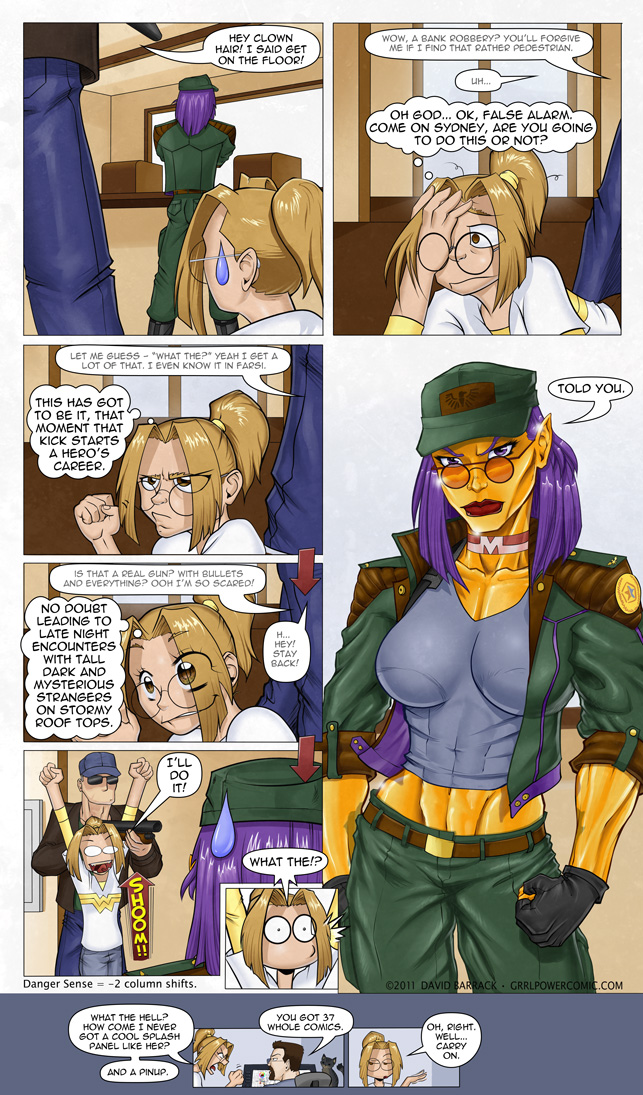
This comic is probably a good example of how not to draw a comic. Any time you need to put arrows to show the flow of the panels, you’re doing something wrong, but I couldn’t figure out how else to lay it out so that I had a nice big panel of Max there at the end. Also, there are two conversations going on. Originally, the background conversation between Max and the robber took place after her reveal and it was mostly shots of her face as she smarted off to him, but then I realized that page didn’t really end with any kind of punch. Doing it this way, I admit it’s dense, but it hits on the reveal, allows me to squeeze in another joke and now I’ve positioned everyone for what happens next. There’s probably a more elegant way to have done all this but at least this way I got to draw that last panel of Sydney which makes me chuckle every time I look at it.
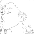
If you want to see two pages that were sort of mashed together to make this page, click here. The art is well over a year old (digging it out of the reject pile I’m surprised at how much it’s improved) and obviously a lot of other things have changed, but I thought some of you might dig a look at something from the reject pile.
Oh I’ve also added a comments subscription checkbox so that option is available if that’s your thing.
Background entertainment while I drew: Tom Baker Doctor Who’s on Netflix.









Discussion (64) ¬
wooooo that was awesome
also first! haha! x3
well i have to say, if i wasnt in school, i’d be laughing my A$$ off at sydney’s face right now
Oh, Sydney… getting your arm tangled up with the robber’s isn’t the best way to start off your heroing when you don’t even realize you did that.
Sydney, bend that arm around the gun, then piston kick him in the balls.
I didn’t even notice the arrows at first, and I followed the flow of the comic just fine.
Agreed. The general rule of thumb with comic reading is that when there are multiple smaller panels to the left (or, if it’s manga, on the right) of a larger panel, you should read those first.
i also was unaware of the arrows.. aside from sydney’s SHOOOM!
i felt like i was hunting for Waldo but yea. it works :D
I love the look on Syd’s face just before she pops up. That and Syd kvetching about not having a Splash and pinup. :D
…I get the feeling I already know the answer, Dave, but are we ever going to see Sydney drawn in the style of the last panel?
Well Syd will eventually get some nice pin-uppy pieces but she’s inherently limited as to how sexy they’ll get.
Depends on how many ppl appreciate slender women yes?
*raises hand*
Yeah, I’ve got a thing for slender women.
I’m actually less interested in Maxima than I am in Sydney. I know, it’s weird…
Slender and THOSE EYEBROWS. Oh man.
There’s something about Maxima’s facial geometry and general anatomical structure that i find mildly off-putting, enough to not find her especially attractive. I’m thinking it might be an optical illusion caused by her unusual palette.
It wouldn’t surprise me if the was a little… tilted. I tend to draw kind of skewed for some reason. It’s easy to see when I flip the page right to left, but I don’t always do that, so that could be part of it. And as many pictures of her as I’ve drawn, most were in black and white. I’m still not good at making her look shiny, so right now she mostly looks just sort of yellow-ish. I need to work on that. Hopefully it will help her look a bit more appealing.
love the bonus mini comic
Ooh, pointy ears.
Darn, I was totally expecting her to take that one robber out by accident, giving him a nice upper cut as she rose up. Ah well, now she gets to play the role of hostage!
Hah hah that would have been pretty good, and in character for her, but it’d screw up the setup a bit.
The ‘fight’ scene reminds me of wrestig with my dad when younger. He would knock me on the grond so often that I got good at jumping up inside his grbs and even knocked him down once. Oh, and kicking the genetalia from prine.
Oh my gosh, not only do they have anime sweatdrops, but they have SHADED anime sweatdrops. That’s right, extra detail. That means that the situation is not only awkward for them but SUPER awkward! Ha.
Also, even though there is a -2 to Danger Sense, there is a +2 to Fortuitous Circumstance as the robber can’t shoot her in that position.
P. S.- Excellent “starry-eyed” expression in panel 4. I laughed so hard when I saw it.
Thanks. Those are supposed to be the stary bishoujo eyes, which I spent a fair amount of time googling and trying to duplicate, only now to realize that when scaled from 600 dpi, they’re too small to really see the detail. I really need to stop zooming in so much. I spend a lot of time on detail that you can’t see when the page is 72 dpi.
we might not see it in passing, but its there visually, and its how you can create awesome visuals like blending without having to worry about the gradient tool. Though i would recommend keeping it under 400 for this particular medium.
The reason I use 600 dpi is that it makes the magic wand tool work a little better, in that it’s better able to get down into those little pinch points where lines converge that would otherwise be unselected. That leaves little white dots all over the picture, but at 600 dpi the dots are so small you can’t see them if I ignore them. I used to spend a lot of time doing touch up on the dots, now I spend a lot of time on details that no one can see, so I’ll have to balance that all out eventually.
Dave, eh – the character development thus far are well worth the 38-comic investment. Your studies of movement and facial expressions shows through. Awesome work!!
I understand about the arrows – one thing you can do (graphic design trick) is to angle the upper/lower edges (~30-ish degrees) of the left hand boxes so they “key” to one another, drawing the eye along their axis, then angle the right border (~60 degrees) of the bottom panel so it keys to the pinup. Just a thought.
I just read your comic from beginning to end in one sitting. The strip is great and the power descriptions made me think of Champions. [Although it uses D6, the DC Heroes game used percentiles though. *Shrugs* Either way your comic is great.]
I’m actually all for the way the robber/Maxima conversation goes on in the background. It’s been all Sydney until now, so it’s natural focus, and then the focus shifts to the stuff we’ve been getting like white noise – “that big, busty la… OMG-look-at-those-biceps!” Except it’s not really the biceps that catch your attention, but you know.
You’re right – it’s the abs ;-)
I see you put arrows to show the flow of comics despite saying it indicates doing something wrong, but I didn’t notice the arrows until after reading both comic and commentary, and I think the direction they’re indicating is actually the natural flow for this layout.
That aside, the mini meta-comic at the bottom is the most hilarious part about this update.
Oh it was fine….. It would’ve been pretty sick if she’d unintentionally clocked the robber in the jaw and knocked him out flat when she popped up…. But Sydney is Sydney. She’ll manage I’m certain.
Soo true… XD
I swear when I read in your commentary that you used arrows my first response was, “What arrows” I would say it actually flows pretty clearly and well.
For someone who couldn`t figure out how the flow works, you did near perfect.
1- They`re to the left, and since English is read left to right, they will be read first. Or at least the top one will.
2- Near identical panels with lots of text are recognized as ongoing thoughts or conversation (or both in this case). The last panel down deviates, but you already created a ‘downdraft’ in the first two, so that`s okay. The effect is lessened by the two panels at the top, though, especially since the second panel, the first of three near identical ones, is on the right side of the page. I mean the wrong side of the page. I… you know what I mean. ;) This may have worked better as two pages? Come to think of it, maybe you should`ve fused the first two panels, and just used the second panel with the robbers remark above Maxima`s reply. Trust me, we all noticed ‘Clown Hair’, there`s no need to show her. And the two lines would explain sufficiently that Sydney remains unnoticed (which she acknowledges, for the dull witted, so no worries there). That would have created a nice downflow on the left, leaving more room for even more Maxima! (Like, detail, dude. ;) ) Now it looks like Sydney is looking at Maxima, which kinda jars with her surprise.
3- Overlap. The panels to the left overlap the panel on the right, pushing the right sided panel into the background, so it will come last.
You know you can use the borders by pointing them to the next panel in line? If you`re going to have structured pages, a slightly heavier border might work better. Right now they look a little too neat.
The arrows down aren`t a problem, though, everybody uses his or her own method and reader will respect that as long as it works. The ‘woosh’ arrow, on the other hand… I feel you could do better.
Also, if the ‘told you so’ is in response to Sydney`s ‘what the’, like I think it is, it should have been besides the last panel. Since most people tend to read the text first, and then look at the picture, that would have created a flow back up, which would have made Maxima look even bigger, and would have made sense too, because of Sydney spending most of this page on the floor. In truth, I`ve seen comics in print, made by top artists, using slanted, overlapping panels and all the above to create a perfect flow line, and then abandoning that line halfway and expecting the reader to teleport across the page to the next text panel. (Which is something readers aren`t equipped to do, so they lose the flow, and with that, the pace of the story.) Text above the heads is not an axiom, it`s a direction. Use it.
Merging Sydney`s line of thought with Maxima`s conversation was spot on. Nice feel of pace there. Overall this is a nice comic with sympathetic characters and a good build up. I`m a fan. Can`t wait for the next installment. Cheers!
Yeah maybe I was overthinking it. It’s just that the tendency to go left to right as you read makes me think that would help to have the arrows but I guess this actually reads pretty naturally. What I really need to focus on is cramming fewer panels on a page – this one isn’t too bad though.
( O.o) Ablabius that took me 4 minutes to read. How do people write so much? :s
If only I could draw. ;)
WOW Maxima LOOKS WAY HOT!!!!
lol how funny that Syd is argueing with you Dave and you dont need to use arows we are all big kids here we can figure it out not that i noticed the arrows anyways but another job well done sir i appluad your funny well wrtten and well drawn story yet again , also reveal the chrataers at yoru own pace i know som peple get antsy but me im patient be sides i can wait for max all day and not complain cuz well look at her tho i’d probly get punch dead in the face i would ask her out with out hesitation you only live once and i rather go out getting punch in the face by an extraodinarly beautiful woman then laying in some bed of old age just my view on that any ways well done again my friend
Periods man! Use them. They’re free! Here, you can you some of my extras……………..
Finally!
you know, given her lunch, Sydney could almost defeat these people by breathing
Nah, breathing won’t do it. A burp, on the other hand…
The problem is, her burping would dispatch not only the would be bank robbers, but likely everybody within a 2 block radius of them.
just imagine what a fart would do.
I think that would be the point when NORAD stepped in.
Way to make a first impression there.
thread this one like, over 10 times…just now got why she said “told you”
*read this
TT_TT i need spelling super powers
That would come in very handy for me ^-^ Also Grammar Super Powers :D
P.S: :s I don’t know why I over capitalize and I hate having to look up words, so I don’t look like a fool :(
I proofread what I write before hitting the ‘Submit’ button. Doesn’t always help, but it gives me the chance to catch errors…
One of my biggest gripes is that even the major publishing houses do NOT do the proofreading on their products that is needed.
Happy Birthday Dave !!
i didnt notice the arrows showing the next frame untill you mentioned it. dont underestimate your reader intelligence please!
I mean no disrespect to you if you’re truely intelligent but from my experience among humanity it’s safer to err on the side of they’re simpltons (or maybe it’s hanging with the military ones). wait the civilian ones I deal with are just as bad.
great comic! i really enjoy reading this!
wooo new one comes out today~ *does a happy dance* an imma get first!
Ohhhhh… Reading through this again a few weeks later I JUST NOW noticed that the gunman is backing up, which is why Sydney didn’t realize she was standing up so close to him!
Yeah I’m still learning the ropes when it comes to sequential storytelling, I probably could have made it more clear how they wound up positioned as they are but as long as no one is confused by it then I can pat myself on the back and say “good enough”
i didn’t even notice the arrows until reading your comment and through comic-design knew which way to read so don’t go being all paranoid man :)
I like the arrows. Not all of us are “true believers”. aka comic nerds.
What is the blue teardrop shape in panels one and five?
It’s a trope I pulled from manga, the sweat drops convey consternation, confusion, nervousness, apprehension, etc.
Probably one of the few times Max would go “what the”
I feel dumb her name’s at the top of the page.
I tawt I taw a puddy tat. I did I did. I taw a puddy cat!
*gasp*
DaveB is a cat person!
More accurately he’s the Cats Person.